Project Overview
Scope
A fictional website redesign of the Nation Weather Service that focuses on reimagining the site’s text-heavy information and outdated format
Methods Used:
Organizational Research, User Research, Competitive Analysis, Heuristic Analysis, User Interviews, Affinity Mapping, Persona Development, Information Architecture, Sitemap Creation, Card Sort, User Journey, User Flows, Usability Testing, Design Studio, Design System Creation, Wireframe Creation, Prototyping, Accessibility Testing
Timeline: 3 week sprint
Team: Four Designers
Role: UX Designer
Tools: Figma, Maze, Zoom
A little TLDR
The Problem
The National Weather Service would like to understand its webpage's current usability and functional problems. NWS is losing visitors due to very text-heavy information, which poses
accessibility concerns.

The Solution
Through research, designing, and testing we came up with a mobile and desktop version that is more modernized and up-to-date. This version of the National Weather Service is more consistent and in tune with the users.

First Impressions
“It’s just redesigning a weather site, it should be easy...right?”
Before I took a look a the National Weather Service site, I underestimated my project. I Thought it would be an easy redesign because many weather site had a similar structure. As soon as I open up the National Weather Service site I immediately ate my words, the amount of text heavy information and clutter that was on the home page took us by surprise. To make matters worse the site didn’t even have a mobile site!
Right off the bat I started to dread this project, thinking that it was unfair that my team probably had the hardest site for this redesign project.
Well with only 3 weeks to complete this project I knew that I had not time to stand there and complain.
Even thought the site was so messy that it almost made us want to start redesigning the site right away. I wanted to keep us from getting side track, so I start by setting up a schedule that will help us focus on each step and allowing us to finish on time. Next I made sure that we take each step at a time, making sure to maximize each process starting with the discover phase.
Discover
Research phase
Where do we start?
To start our research phase we go back the the National Weather Service’s issue, “why are they losing users”. Before jumping ahead the users interview and creating questions, I asked my team who are these users?
I wanted to back track a little and find out who are the majority users that would use the National Weather Service site or even any weather site in general. From there I suggested that we do a simple user survey so that we can mass collect data on who our target users are.
Conducting User Survey
My team and I came up with a 20 question survey to send out for the public to answer, due to time constraint we were only able to gather 1 days worth of data. After collecting the data we were able to have a general idea of our target user that would use a weather service site/application.

Here are a few of the key results we are able the take away from our user survey
Now that we know who are users are we can move on to creating user interview question and conducting a original site usability test to find out more on our target demographic and to find out the current pain point of our site. Knocking two birds with one stone!
Insight from the users
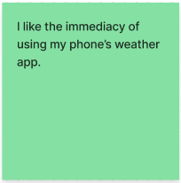
After conducting user interviews to find answers to questions like what prompts our users to look up weather information?, what weather site or app they typically use?, and what they liked and disliked about their current weather site/app?.


Here are a few of the key results we gather after creating an affinity map
Testing the Original site
During our user interviews we also asked our users to walk through a usability test. Based on the survey data from earlier, we created 3 tasks, all focusing on day-to-day actions a user would take when checking the weather


Validating and Invalidating our assumptions
During this time we conducted heuristic evaluation and were able to identify some opportunities for improvement. There were confusing double “enter your address” bar making users to not know where they can enter their address to look up the weather in their area, the multi-layered navigation bar made looking up any additional information confusing and lastly the misleading buttons that would warp you to the mother site, the NOAA, without any help on how to return to the National Weather Service site.
After testing the original site, the data was able to confirm with us what were the users pain points when navigating through the website and also validating our evaluation on the heuristic test.
What is the good new?
For starters the users only needed to put in their address once, even though it was confusing on which search bar to use, the site was able to remember your address for the next time you visit.
The bad new though…
The website was overall very confusing with too much text. The poor navigation may cause the user to get lost or even trapped in another site. The map was confusing to read and it’s own legend only added more fuel to the fire since most users didn’t even understand it.

Revised Problem Statement
So now that we have a good understanding of our user and their pain points, we can revise our problem statement to be user-centric.
Matt quickly becomes frustrated when using the National Weather Service’s desktop and mobile site because he cannot quickly and easily access the weather information he’s looking for due to poor information hierarchy, lack of consistency throughout the site, and excess confusing jargon.
HMW
With a revised problem statement, we can start brainstorming on how to solve the problem and asking ourselves how might we come up with solution to do just that
How might we deliver a mobile-first design that will enable Matt to access the weather information he needs quickly and succinctly?
Before moving on to the design phase, let’s take a look at our competitors
Based on our survey and user interview, we gather the few most popular site/application our users used and did a competitive analysis to find out why our users use them, what works, and what can we be inspired by.

The weather channel’s clean and understandable navigation bar. Their overall style and color them

The weather channel’s clean and understandable navigation bar. Their overall style and color them

The IOS Weather app’s overall pleasing aesthetic and design layout brings familiarity to majority of our users
Design
While I was in charged of the desktop potion of the design, I still had to take my approach slow and work closely with the mobile design team, making sure I don’t jump ahead of them.
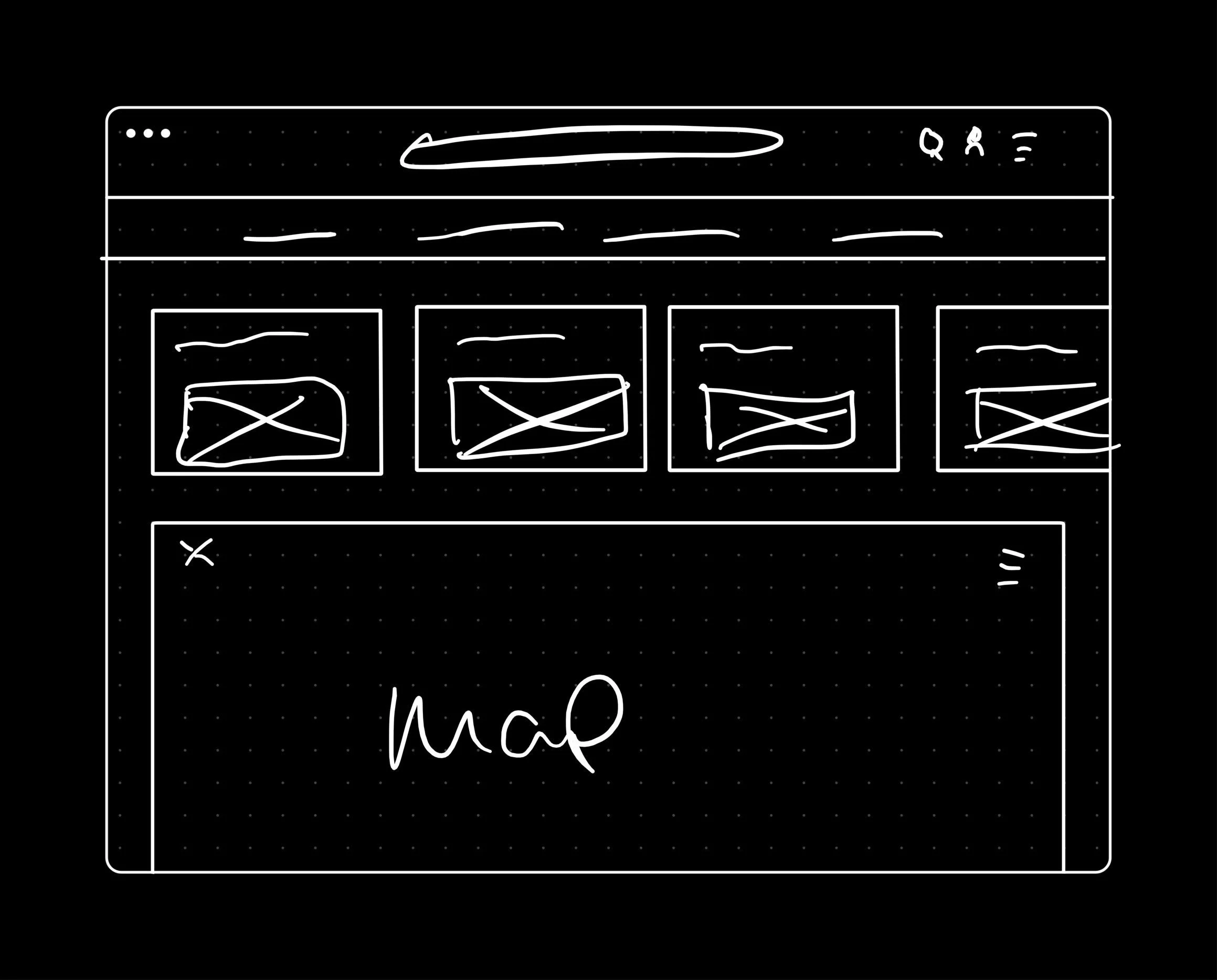
Once the mobile team completed their design sketches I wanted to sit down together and come up with a few sketches that would transfer the the mobile site over while making use of the large desktop real estate.
Sketch concept


Bringing life to the sketches as lo-fidelity wireframes


We ran into some issues…
We wanted to test the flow of our site before moving on, the result were not so good.
Users that took the usability test stated that on both mobile and desktop site, many information were still hard to find due to lack of indicators or not being laid out for the users to see right away.
So back to the drawing board we go!
Design Clash
Here is were we ran into our next challenge…
With the feedback we received from our recent usability test we needed to revamp our desktop layout. My partner and I had great idea and liked some elements that each versions brings to the table, but neither one of us wanted to commit to either design.

My layout
I wanted the scroll on the right of my version, making it the main call to action and information center

My teammate’s layout
My team member wanted to get rid of the info center entirely and expanding the right information to be the main source of information
Compromise
Thankfully I was no stranger to this, as an architectural designer in my previous job having design clash with clients is very common, My method is compromising!
I would brainstorm different ideas and present them to my teammate incorporating both our designs until be collectively agree on a design.
After a few back and forth, one of my design actually stuck the landing!

By rotating the info center to be horizontal it allows the other information to still be expanded
it’s the best of both worlds!
Deliver
Now that we made it through the design phase it’s time for one last usability test
The results are in!
User success in finding local weather information grew from 5/8 users on the existing desktop site to 8/8 users (combined mobile/desktop) on redesigned site
User success in finding local severe weather alerts grew from 5/8 users on the existing desktop site to 8/8 users (combined mobile/desktop) on redesigned site
Final Prototype
After getting good test results back we were able to fully add the rest of the components to the site

Concept site Desktop

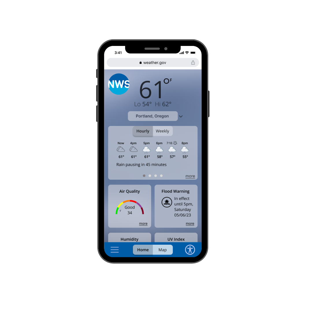
Concept site Mobile
Home page

Concept site Mobile
Map page
with the desktop’s large real estate we were able to fit the user’s main goal all in one page
Next Steps
After creating a site that meets the user’s main needs, what’s next?
Taking the mobile site to the next step and creating an app that would be easier for all users to access The National Weather Service.
Redesign the “Information” page, to allow an better flow for user to access information on other weather related topics.
Redesign the “Education” page, allowing user to easily look up any safety videos and reduce their chances of being at risk of any weather related hazards.
Creating an easy to use filter for the desktop map, that show case weather hazard in the local area
Things I learned from this project
Never under or overestimate anything! creating these assumptions can ruin your judgement before the beginning of the project and overall workflow. Always enter each project with an open mind!
Start with a plan and the goal in mind. Laying out the tracks for my team helped us be one of the first to complete our project before the deadline.
Communication in the team is key, a well laid out plan is nothing without good communication. My team was able to communicate with each other through out this project, allowing us to utilize each others strength and cover each other’s weaknesses
Compromise! Always work together to find a solution, even if mean abandoning your old ideas cause hey! your next one might be a hit. It was a great feeling when my team loved my new desktop edit!
Thank you for reading my case study
Want to work together? Feel free to contact me! or message me on Linked In.