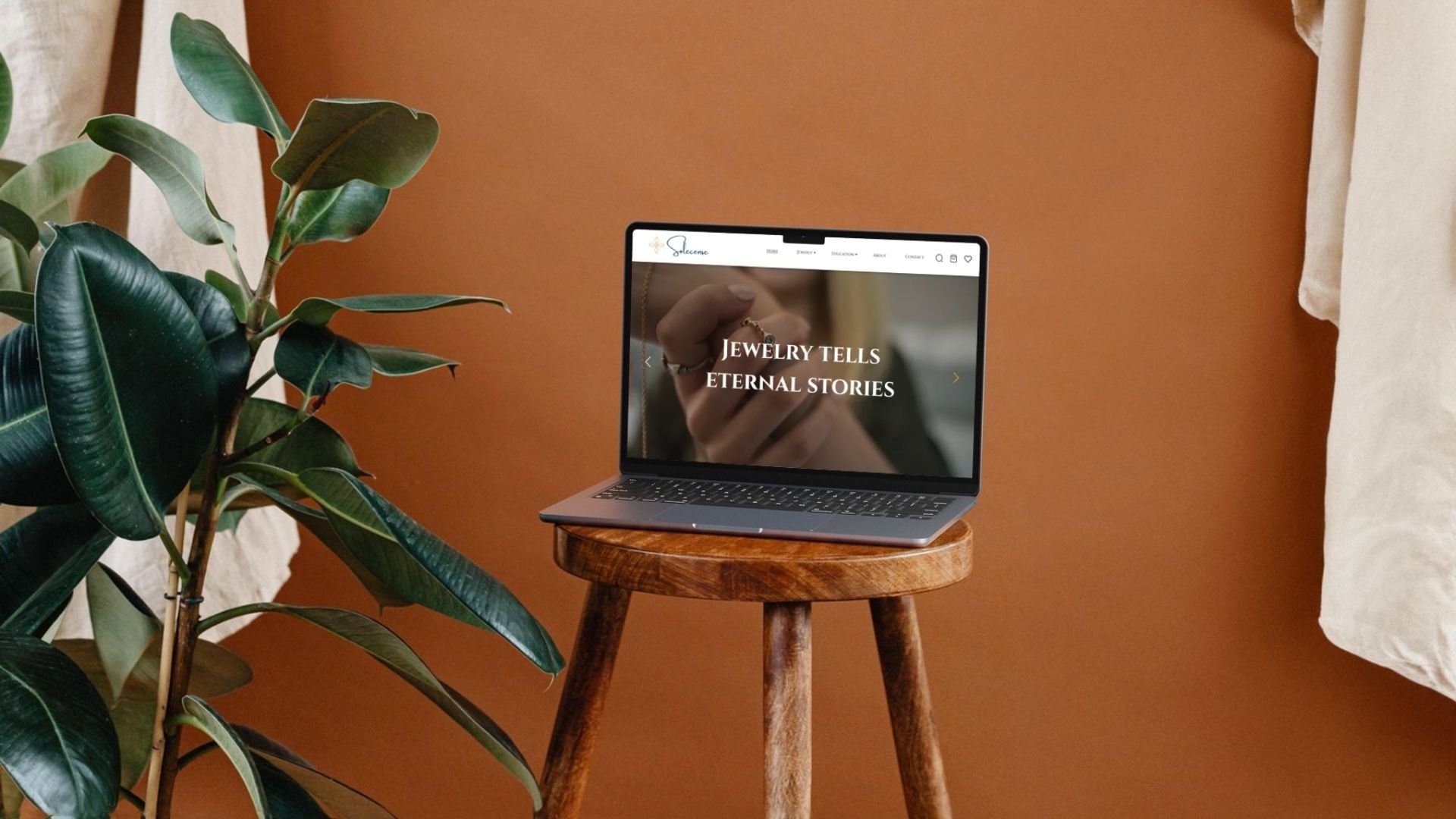
Solecense
Designing a storefront that doubles as a portfolio for an independent jewelry designer
Timeline: Under 2 weeks
Role: UX/UI Designer (freelance) — discovery, wireframes, visual design, responsive design
Deliverable: Full desktop + mobile site design (Home, Shop, Product, Cart, Checkout, Order Confirmation, About, Education, Contact), handed off for development
Tools: Figma
Project Overview
Solecense's client came to me as an independent jewelry designer looking to launch her first e-commerce site. But this wasn't a typical "build me a shop" brief — she needed the site to work double duty: a functioning storefront where customers could browse and buy her pieces, and a portfolio that showcased her upcoming designs to build her name as a designer. One site, two jobs.
My responsibilities on this project:
Ran discovery with the client to understand her brand, her collection, and how she wanted to present herself alongside her products
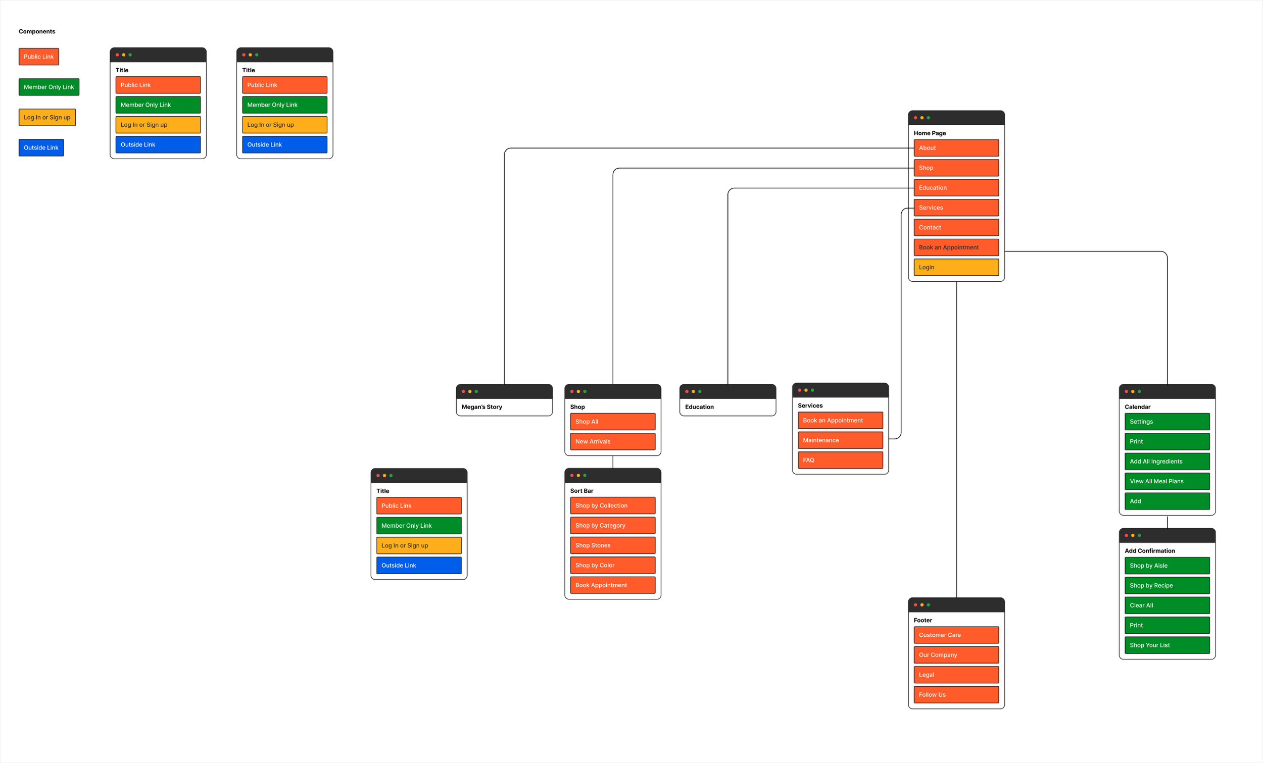
Mapped out the site structure and page flows
Designed the full visual UI in Figma across every core page
Designed responsive (mobile) versions of every page
Handed off the finished designs for development
A Little TLDR
The Problem: The client needed a site that felt like a real jewelry brand — not just a product catalog — while still handling the mechanics of a full e-commerce flow (browsing, cart, checkout, confirmation). Most small designers' sites tip too far one way: either a slick shop with no personality, or a beautiful portfolio with a clunky bolt-on store.
The Solution: I designed a site where the storefront and the personal brand share the same visual language throughout, rather than living in separate parts of the site. The navigation puts Jewelry (shop) right alongside About, Education, and Contact as equal citizens, so a visitor can move from "here's a bracelet I'm buying" to "here's the person who made it" without the tone shifting.
First Impressions: A two-week timeline for a full multi-page, responsive e-commerce design is tight. It pushed me to make decisions quickly and trust a simple, elegant visual system rather than over-designing every page from scratch.
Discover
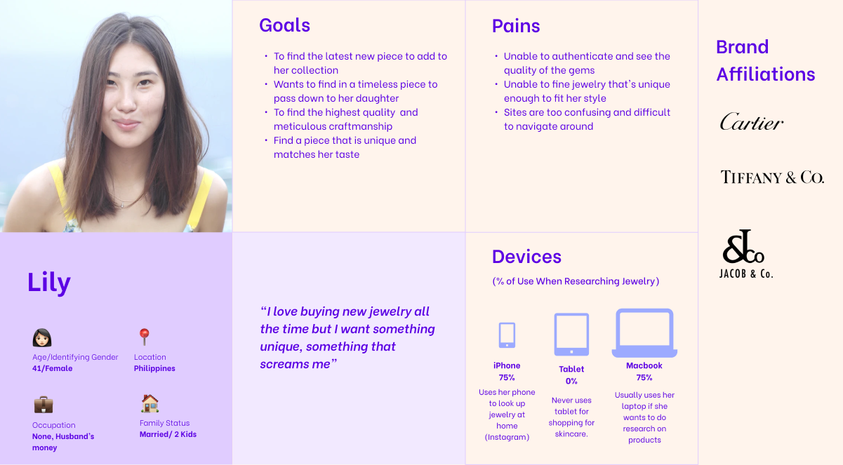
I started with a discovery conversation with the client to understand two things: her brand (elegant, feminine, jewelry-forward) and her actual goals for the site. What came out of that conversation was the core tension I mentioned above — she needed to sell now, but she was also actively developing new pieces and wanted the site to read as her portfolio as a designer, not just a checkout page for whatever she currently had in stock.
That reframed the brief for me. The site couldn't just be "a Shopify template with her products in it." It needed:
A clear e-commerce path (Jewelry → Product → Cart → Checkout → Confirmation) that felt trustworthy and easy
Dedicated space for her as a designer (About Solecense, About the Designer) treated with the same visual weight as the shop
An Education section, so she could speak to her expertise and process, not just her inventory
Design
I built out the page set in Figma, starting with structure and moving into visual design once the flow felt right:
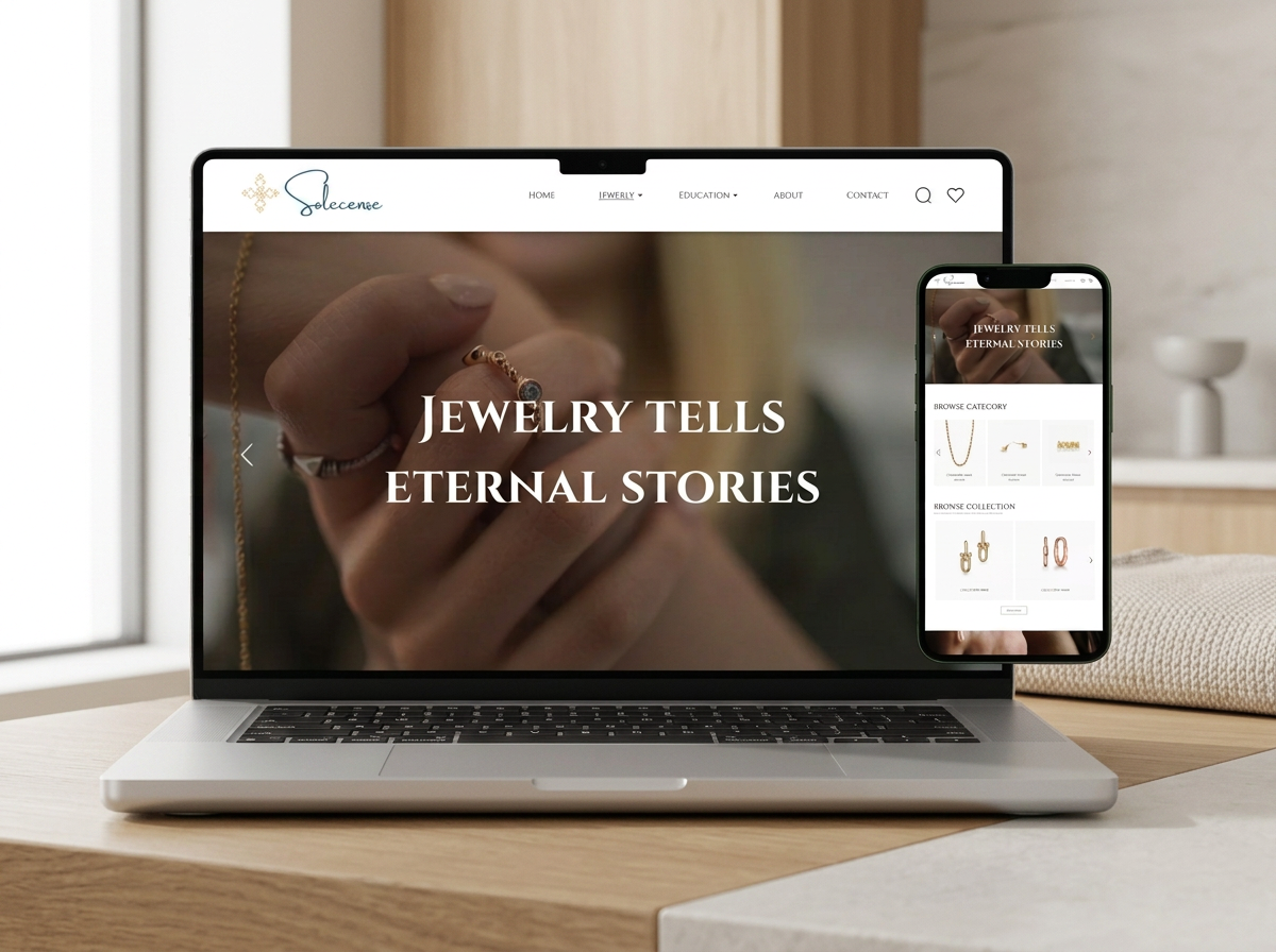
Homepage — a full-bleed hero ("Jewelry Tells Eternal Stories") with category and collection browsing below, plus a "Bespoke" section that hints at her custom/upcoming work
Jewelry/Shop — category browsing into individual product pages with size selection, product details, and related items
Cart, Checkout, Order Confirmation — a clean, standard flow, kept simple and low-friction since this is where trust matters most
About Solecense / About the Designer — full editorial-style pages, given as much visual care as the product pages
Education & Contact — supporting pages that round out the brand rather than feeling like afterthoughts
Visually, I leaned into a soft, elegant palette — warm neutrals and blush jewelry photography against clean white space, a serif display typeface for headings that reads as refined without being fussy, and a muted blue accent for calls to action so they stand out without breaking the mood.
Every page was designed at both desktop and mobile sizes, since I knew from the start that most of her audience would be discovering the brand on their phones (through Instagram, most likely) before ever landing on desktop.
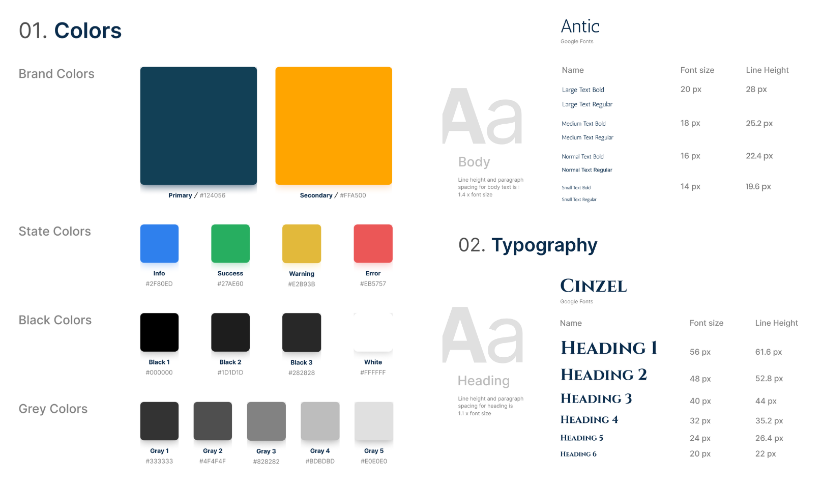
Wireframes
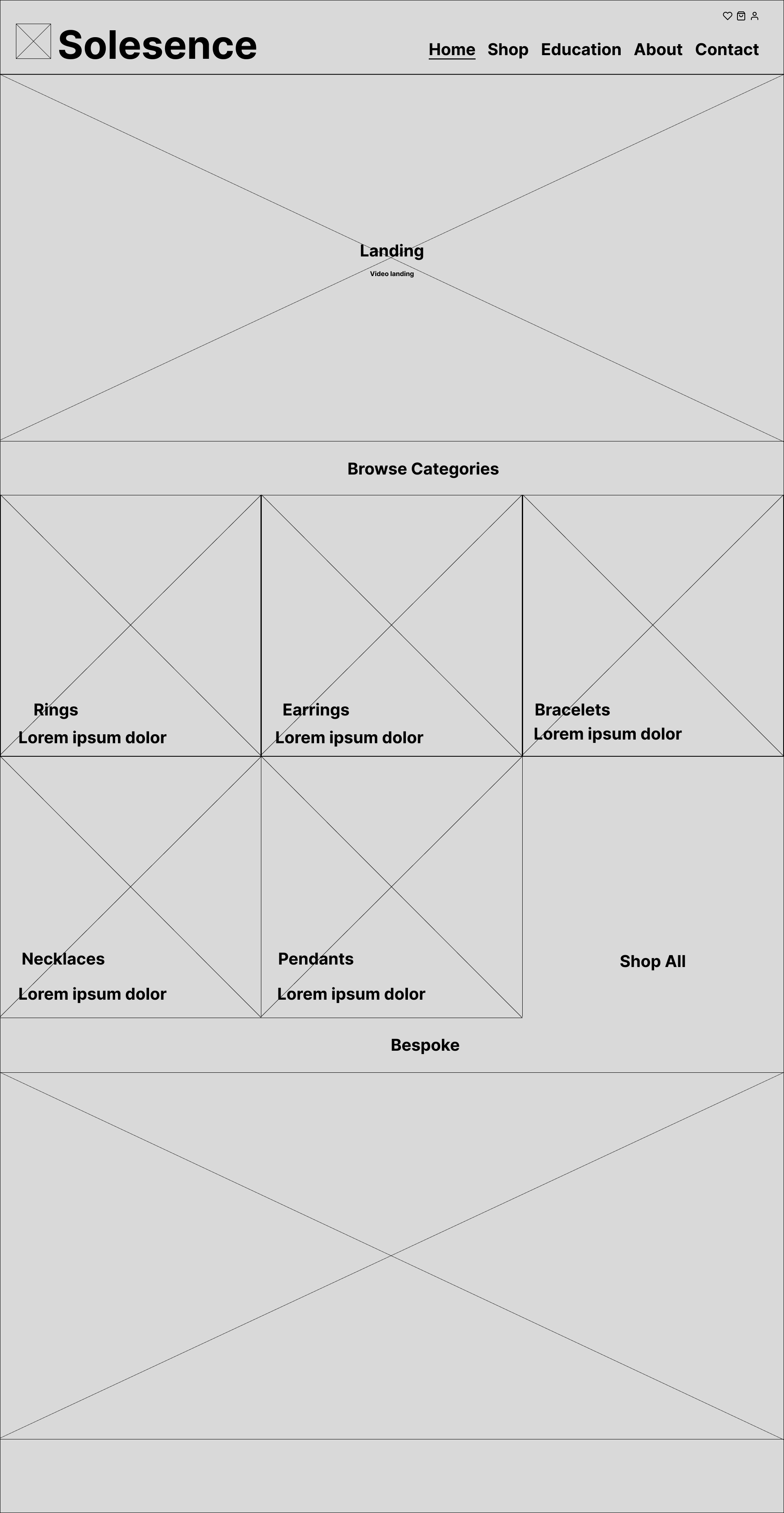
Home Page
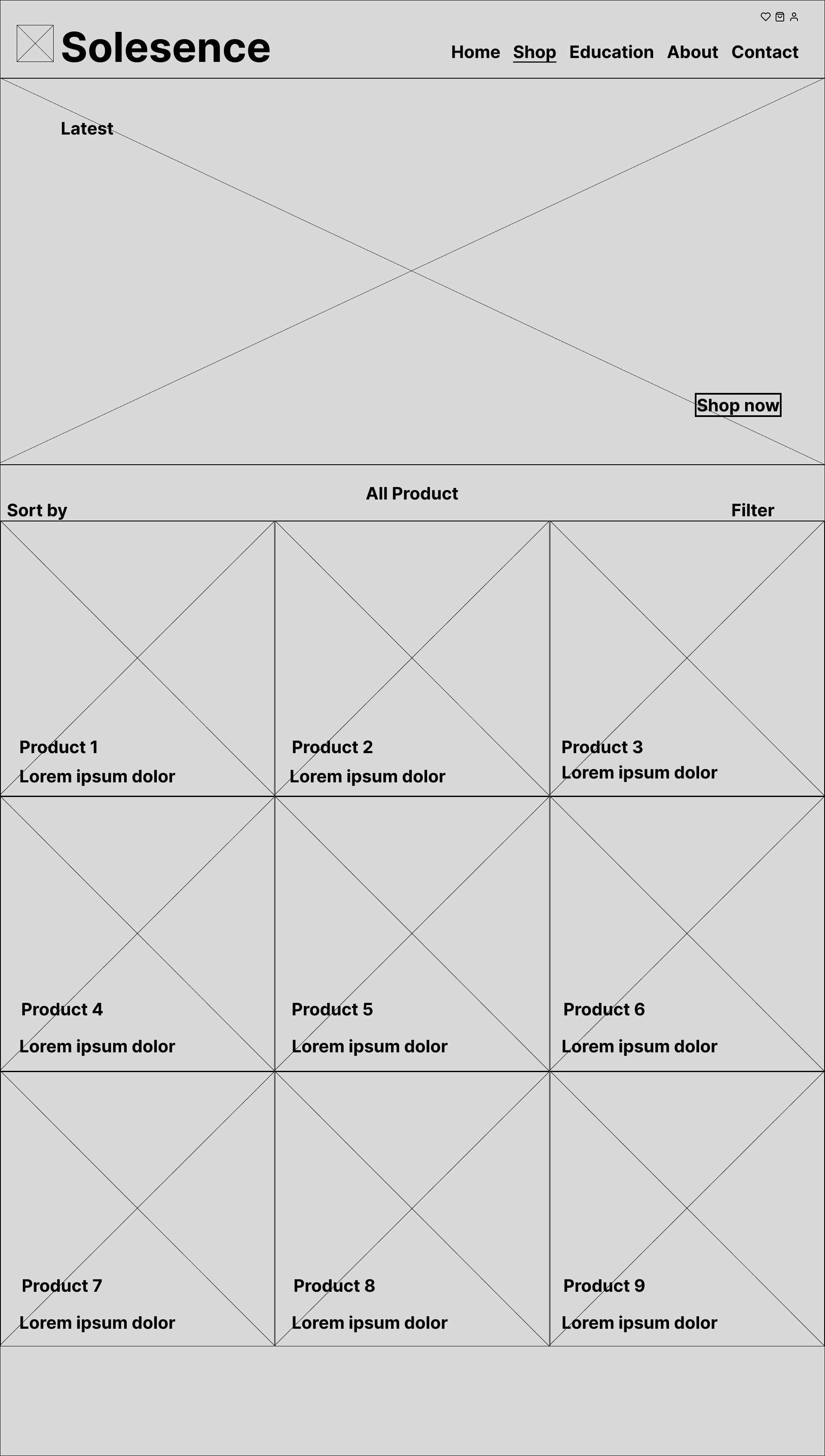
Shop Page
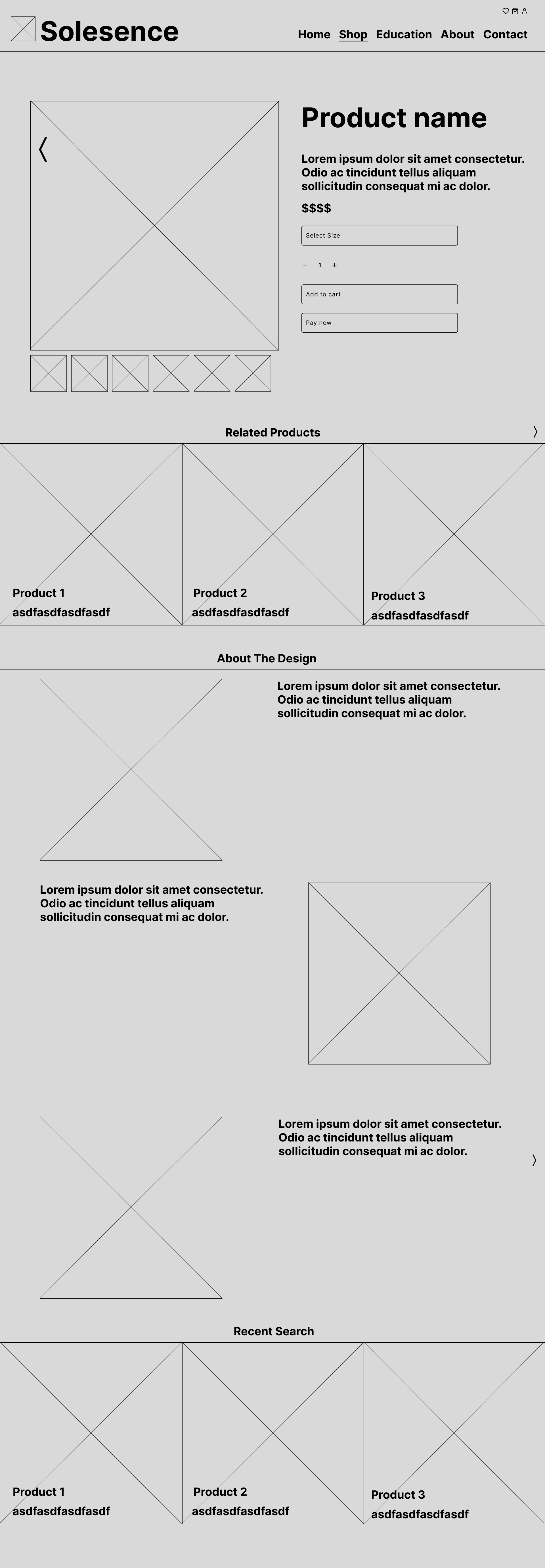
Product Information Page
Deliver
The final deliverable was a complete Figma file covering every core page in both desktop and mobile, ready for development. I handed the designs off to a developer to build out — I wasn't hands-on with the code myself, but stayed involved to make sure the build matched the design intent.
(Images are placeholders)
Things I Learned
Two weeks is not a lot of time to design an entire e-commerce experience, and it taught me to protect scope early rather than letting "just one more page" creep in. It also reinforced something I keep relearning in client work: the brief you're given at the start is rarely the whole picture. The real design problem here — a shop that's also a portfolio — only surfaced because I asked about her goals beyond "I need a website," not just her feature list.